Showing posts with label rabbit et roses. Show all posts

Tuesday, February 17, 2015

2014 Christmas Cards

One of these years, I won't be so last minute about things. I actually had a Christmas card design prepared months earlier but, when push came to shove, I was feeling a little art deco and switched things around.

The cards are simple, and I had a two-hour window while my daughter napped to do the make ready and run 100 cards through the press twice. Miraculously, I just barely made it.

They're not perfect and they didn't all arrive at their destinations before Christmas, but... we had a card! (And a lovely new family photo, thanks to James Everett Photography.)


Tuesday, March 12, 2013

Sneak Peek: Merci Beaucoup Notecards

I am slowly beginning to create designs and inventory for an eventual online shop, and as I am a bit of a Francophile, the first few will be in French. These flat thank you notes are printed on my favorite 100% cotton paper.

Friday, December 28, 2012

oink.

These piglets were a fun departure from the rest of the custom stationary I printed over the holidays. They are printed on 100% cotton A6 flat notecards, packaged with charcoal envelopes.

Untitled

simple thank you's

Untitled Untitled

These thank you notes were printed on high quality ivory, textured Italian paper stock sold by Cavallini & Co.

Custom Stationery

Before printing our holiday cards this year, I printed eight sets of custom stationery as gifts (not all pictured), packaged as boxes of 10 envelopes and flat cards.

The majority were printed on 100% cotton A6 flat notecards, using fonts by Emily Lime Design.

Untitled Untitled Untitled Untitled Untitled Untitled

2012 Holiday Card

Hopefully our holiday cards have all reached their destinations. I didn't intend to wait until the last moment to design and print our cards this year, but due to some circumstances beyond our control, we spent much of the Christmas prep time away from home - and away from the letterpress.

I wanted to create a letterpress photo card (much like what Apple offers here), as it was Izzy's first Christmas, but I wasn't sure where I could order only the photo print, on nice card stock.

So we went for an A6 flat card on Paper Source's lovely new Savoy Cotton paper and sent a separate photo of our daughter. We were trying to keep it simple, and were hoping for a sort of modern vintage feel. I'm not super thrilled with how the cards came out, but they made it into the mail before Christmas!

Untitled Untitled

Wednesday, May 9, 2012

Isobel's Birth Announcements

Nearly everyone who reads this blog should have gotten Isobel's birth announcement in the post by now, so I think we're safe to post a few images.

A few notes - I designed the announcements before she was born and filled in the details afterward. My mom came over to watch Isobel while I printed these; it was actually the rest of the prep work, not the printing, that took the most time - cutting and adhering photos (why did I think wallet sized photos would come perforated? isn't this the future?) and tracking & writing down addresses. So, a tip for moms-to-be, address the envelopes before the baby comes!


I thought they turned out rather well, but here's my lovely daughter's take:

Monday, April 2, 2012

Custom Wedding Invitations

I had the honor of designing and printing custom letterpress wedding invitations for my cousin Jessica and her fiance, Tim, who will be married the first weekend of May. This was admittedly new ground for me, and I hope Jessica and Tim are as pleased with the results as I am.

Sunday, January 15, 2012

Marriage, a Journey

This project has been long in coming. In truth, I'm skirting the statute of limitations for getting my gift to the couple within a year of their celebration. The quote here by Frederick Buechner used to be at the bottom of the bride's emails, sent during years abroad with the Peace Corps and the Foreign Service. She now signs her emails with a new quote, but this one seemed apt in relation to marriage.

The gift needed to be small, as the couple moves every two years, and the wooden cutting or cheese board beneath the frame, made by Russell James Ooms, is a small piece of California that can hopefully travel with them.


UntitledUntitled

Monday, January 2, 2012

Our 2011 Christmas Cards

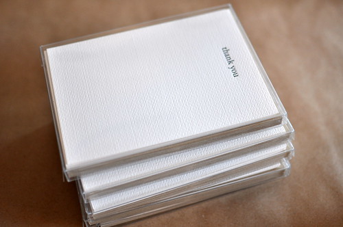
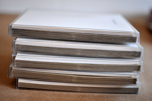
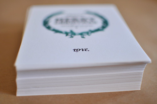
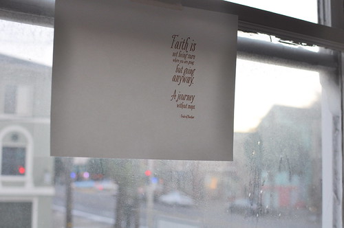
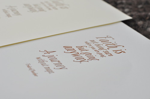
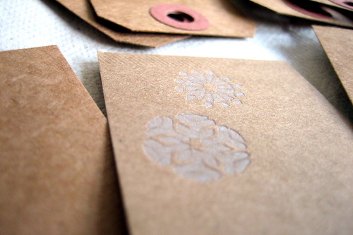
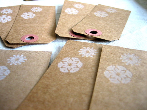
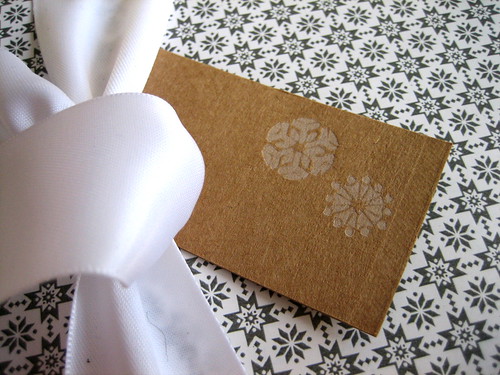
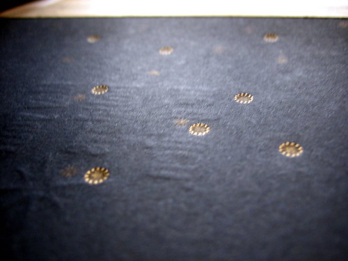
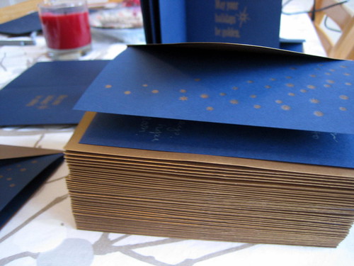
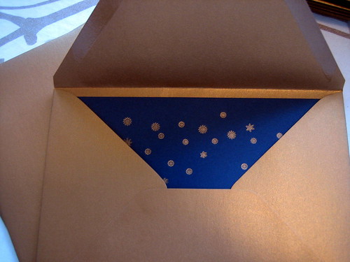
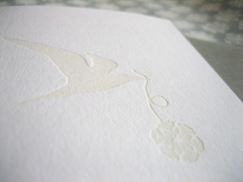
The idea this year was simplicity. I was thinking about printing white on white, and I was thinking about snowflakes - perhaps because I began designing our Christmas card while in the mountains over Thanksgiving, where it snowed ever so briefly one afternoon. Our card was nearly finished when my laptop decided to stop working.

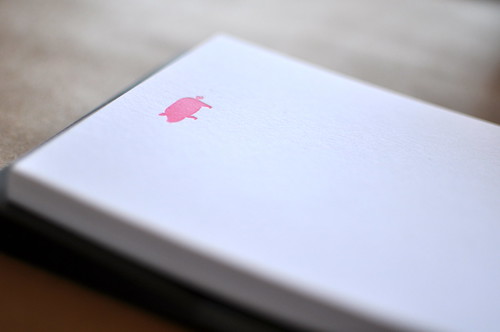
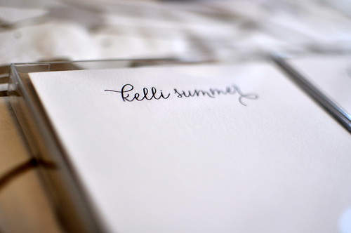
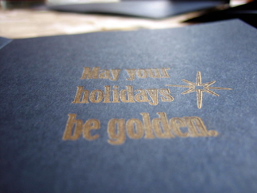
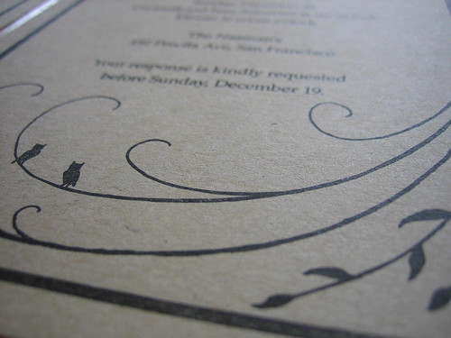
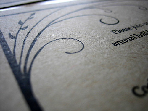
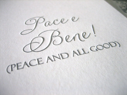
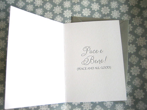
Still, perhaps this hiccup was fortuitous. I'd chosen a lovely quote for the card ... lovely but not quite right, the result of a Google Search, and for the rest of our stay in Tahoe, I was forced to stay offline. Instead I walked, took some cooking lessons from my mom, and read. I was doing some research on St. Francis of Assisi and his good friend, St. Clare, when I came across the words printed on the inside of our card. The phrase is attributed to St. Francis, some 800 years ago. The words rang true. They are simple. And it never hurts that they're in Italian. The association with St. Francis is perhaps why I added a bird; I'm not sure. That happened rather last minute when I scrapped the previous card design and started over a few weeks later - at home, with a repaired computer. We got the cards printed and out in the nick of time.


The holidays always feel like a long time coming and then pass so quickly. I hope everyone had a merry, joyous Christmas and holiday season.

Letterpress Gift Tags

Sunday, December 26, 2010

Year One: Letterpress Christmas Cards


My husband asked how I felt about having created a Christmas card from start to finish and the answer was: relieved. Meeting this goal has been on my mind for more than a year. However, I wish the preparation had been; now I understand why Christmas begins in July.

Our inspiration was a cross between constellations and chapel ceilings. The design, a term I'm going to use loosely here, since it was done quickly and after midnight one night, actually resembles neither chapel nor night sky. We went with a back-up design after not liking how our initial one printed. Some of the photos above are mess-ups, as it was tricky business running the cards through a couple times and not letting them stick to the ink plate. The mess ups were quite pretty in some ways - large, unexpected swashes of gold.


The hardest and most ridiculous part of printing our Christmas cards was the nearly 2 hours it took us to open the vacuum-sealed can of ink. Fortunately, the set up and registration was comparably easy and unusually fast after that. It was my first time using oil-based ink and the platen was either over-inked or there was too much packing and pressure on the plates because the print is not clean. At any rate, we finished just in time for Christmas! And through the thoughtfulness and generosity on the part of several people, I got a brand new copy of the CS5 Design Suite!

I hope everyone's holidays were wonderful.

Wednesday, December 15, 2010

My First Print Run!

I think I can safely post these images now... invitations were mailed and hopefully received by now by anyone who might happen to check this blog ...


The clients are friends, and the beautiful frame with the leaves and owls was hand drawn and provided by them, so I can't take credit for the design.

Overall I was pleased with the print quality. I've learned at the Center for the Book that a lot of what people like in letterpress is error - the heavy impressions, for example, and sometimes, the inconsistency. The paper was fairly thin and flat so I didn't allow for much impression in this case; when I did, the ink was too visible on the back side. I was mostly happy that it was a choice, that I was able to successfully control the impression. The thicker lines didn't always print as a solid, dark black, but that was somewhat expected. I definitely learned a lot in the process and, next up, Christmas cards ... better late than never, I hope!