Sunday, December 26, 2010

Year One: Letterpress Christmas Cards


My husband asked how I felt about having created a Christmas card from start to finish and the answer was: relieved. Meeting this goal has been on my mind for more than a year. However, I wish the preparation had been; now I understand why Christmas begins in July.

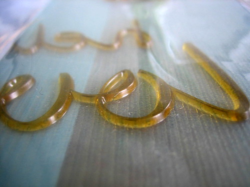
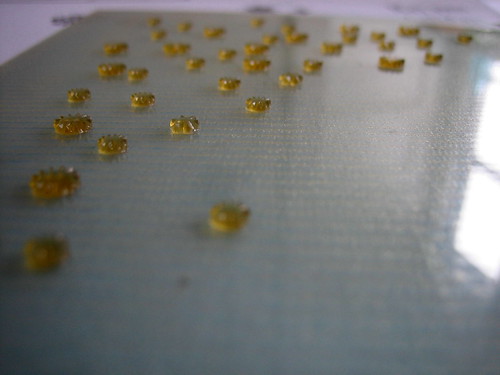
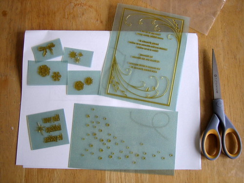
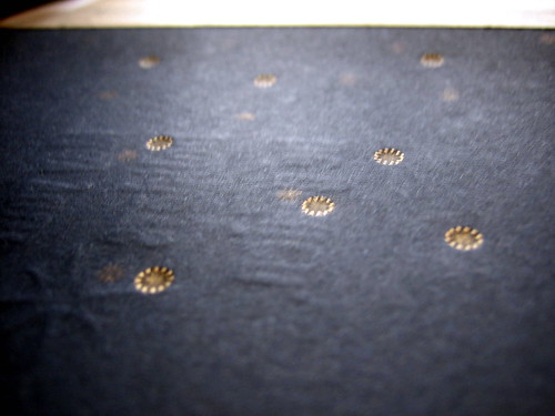
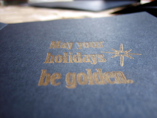
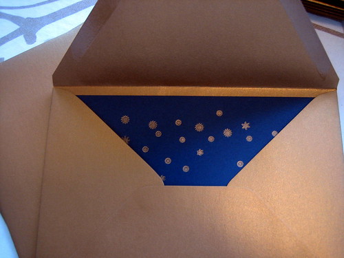
Our inspiration was a cross between constellations and chapel ceilings. The design, a term I'm going to use loosely here, since it was done quickly and after midnight one night, actually resembles neither chapel nor night sky. We went with a back-up design after not liking how our initial one printed. Some of the photos above are mess-ups, as it was tricky business running the cards through a couple times and not letting them stick to the ink plate. The mess ups were quite pretty in some ways - large, unexpected swashes of gold.


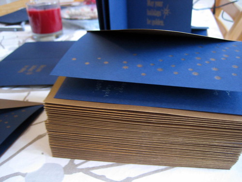
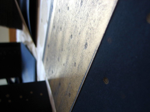
The hardest and most ridiculous part of printing our Christmas cards was the nearly 2 hours it took us to open the vacuum-sealed can of ink. Fortunately, the set up and registration was comparably easy and unusually fast after that. It was my first time using oil-based ink and the platen was either over-inked or there was too much packing and pressure on the plates because the print is not clean. At any rate, we finished just in time for Christmas! And through the thoughtfulness and generosity on the part of several people, I got a brand new copy of the CS5 Design Suite!

I hope everyone's holidays were wonderful.

Wednesday, December 15, 2010

My First Print Run!

I think I can safely post these images now... invitations were mailed and hopefully received by now by anyone who might happen to check this blog ...


The clients are friends, and the beautiful frame with the leaves and owls was hand drawn and provided by them, so I can't take credit for the design.

Overall I was pleased with the print quality. I've learned at the Center for the Book that a lot of what people like in letterpress is error - the heavy impressions, for example, and sometimes, the inconsistency. The paper was fairly thin and flat so I didn't allow for much impression in this case; when I did, the ink was too visible on the back side. I was mostly happy that it was a choice, that I was able to successfully control the impression. The thicker lines didn't always print as a solid, dark black, but that was somewhat expected. I definitely learned a lot in the process and, next up, Christmas cards ... better late than never, I hope!

Friday, December 10, 2010

Imprimatur: Let it be Printed

Let's hope the Latin translation is correct. Everything sounds better in Latin.

A couple things:

1. The new header is not my logo. I am very much in continued transition where the letterpress is concerned and not ready to jump into business. Still, I've heard that if you have a press you should name it. Not the press literally, but your work.

2. For now, I'm going to keep this blog for what it is: a place to share progress & projects. A new blogging platform or website may come later when I have inventory to sell.

3. Milestone achieved! Though arduous, though imperfect, though slow ... we finally have all the parts necessary to actually use the press, and we did our first print run last night. Photos to come soon...

In the meantime, this is what polymer plates look like: