


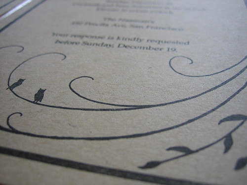
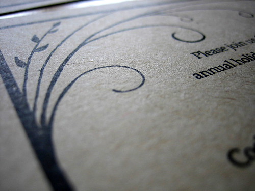
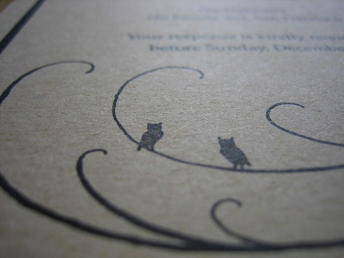
The clients are friends, and the beautiful frame with the leaves and owls was hand drawn and provided by them, so I can't take credit for the design.
Overall I was pleased with the print quality. I've learned at the Center for the Book that a lot of what people like in letterpress is error - the heavy impressions, for example, and sometimes, the inconsistency. The paper was fairly thin and flat so I didn't allow for much impression in this case; when I did, the ink was too visible on the back side. I was mostly happy that it was a choice, that I was able to successfully control the impression. The thicker lines didn't always print as a solid, dark black, but that was somewhat expected. I definitely learned a lot in the process and, next up, Christmas cards ... better late than never, I hope!


Wow - they're gorgeous!
ReplyDeleteThank you! xo
ReplyDeleteThese are lovely!
ReplyDeleteThank you, Mina!
ReplyDelete