Stationary is becoming a luxury instead of a staple. The advent of email, ecards and the like make it easier than ever to say thank you or happy birthday or "I've arrived safely" and so on, which is a good thing. Not to mention, greener.
So I'm not here to advocate or change anyone's mind about using paper stationary, but for what it's worth, here's a recent CBS News segment on sending handwritten thank you notes:
(As seen via @stationaryshow on Twitter; may not display properly on Firefox browsers)
Personally, I grew up writing and sending thank you notes for every holiday, gift, etc. and when I was a tween, I had something like 7 pen-pals, including one as far away as Russia, which was then still part of the Soviet Union. Besides my stock of Hello Kitty papers, I also had my great-grandmother's stationary, which was always tissue-thin, perfumed, scallop-edged, in pale pastels. There was some yellow stationary I remember well, printed with butterflies. It was lovely and I used it all.
Jane Austen once wrote to her sister:
I have now attained the true art of letter-writing, which we are always told, is to express on paper exactly what one would say to the same person by word of mouth...
My own opinion is that a hand-written thank you note is a nice gesture, but only if it's not completely generic. You can always recycle the paper afterward. Otherwise, maybe a simple thank you in some other form would be best, though I've recently heard that saying thank you publicly and online - on Facebook or Twitter - is not good etiquette because it lets your inner circle know what they've missed or were excluded from. That, too, can be argued in more than one way. It's tricky business, being modern.




Wednesday, February 9, 2011


Tuesday, January 11, 2011
Lovely Ladies
It was a beautiful, clear - if not bitterly cold - Sunday in Golden Gate Park and it was hard not to be struck by the beauty, the activity, and the vibrance of life in the city... farmer's markets and street musicians, coffee shops and bakeries with lines out the door, steam or fog rising from a botanical garden, children running through it... and then inside the Hall of Flowers it smelled just like an old library book and there was this tangible evidence of other vibrant lives, in other places, in other times. I bought mostly postcards because they are small and inexpensive and because they are interesting. I found myself feeling glad that they hadn't been thrown out with the trash.
At $0.25 or a dollar per card, I bought anything (but not everything) I found inspiring in some way. Sometimes I bought something for what was written on the backside. Sometimes for the different phrasings of greetings from olden times. Sometimes for the humor, or beauty, or general weirdness. I was drawn mostly to the Victorian and the art deco.
One of my finds at the vintage paper fair, which seemed somewhat unusual, was this postcard of a typesetting room in another part of the world, a long time ago. This is very tedious work!

I'm not going to post everything I bought, and not all at once, but here are some lovely ladies I seem to have collected:


Monday, January 10, 2011
Why the Devil Don't You Write?
I picked this up at last year's Vintage Paper Fair:

My intention at the time had been to send it to a particular someone - someone who, for some reason, has always tolerated this kind of behavior from me. But I never did send it, and now I don't think I'm likely to. I'm somewhat resolved to be less obnoxious and more of a grown up this year.
This postcard is undated, though it was sent from Harry to Ella (Miss Ella, I should say) and it seems that Harry was directing the question to himself. Postage at the time was 1 cent domestic and 2 cents foreign, and the backside was intended for the address only. This year I saw quite a few postcards aimed at goading a friend or relative into writing, though this was the only one to invoke el diablo.
Monday, January 3, 2011
Holla, 2011!
I am ready for a new year. For clean spaces, new starts, renewed vigor.

And I wonder if I had this this awesome golden recycled wooden sign (as spotted on sfgirlbybay) on my wall, if it would remind me to welcome things. Or be cheerful. Or keep a sense of humor.
A less room-altering start are these (more practical, less expensive) really cool downloadble desktop wallpapers I randomly came across while browsing through The Donut Project website:
 Letterpress-related: Wood Type Alphabet

Practical Information in a Handy Form

I Work Because I Love This Shit
And I wonder if I had this this awesome golden recycled wooden sign (as spotted on sfgirlbybay) on my wall, if it would remind me to welcome things. Or be cheerful. Or keep a sense of humor.
A less room-altering start are these (more practical, less expensive) really cool downloadble desktop wallpapers I randomly came across while browsing through The Donut Project website:
Practical Information in a Handy Form
I Work Because I Love This Shit
Sunday, December 26, 2010
Year One: Letterpress Christmas Cards
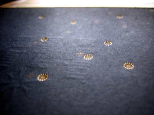
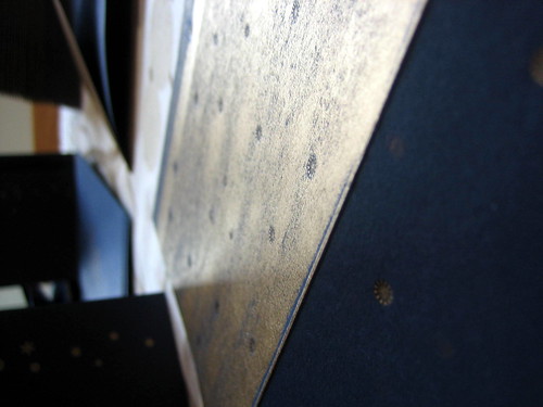
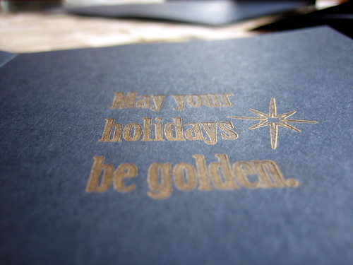
My husband asked how I felt about having created a Christmas card from start to finish and the answer was: relieved. Meeting this goal has been on my mind for more than a year. However, I wish the preparation had been; now I understand why Christmas begins in July.
Our inspiration was a cross between constellations and chapel ceilings. The design, a term I'm going to use loosely here, since it was done quickly and after midnight one night, actually resembles neither chapel nor night sky. We went with a back-up design after not liking how our initial one printed. Some of the photos above are mess-ups, as it was tricky business running the cards through a couple times and not letting them stick to the ink plate. The mess ups were quite pretty in some ways - large, unexpected swashes of gold.
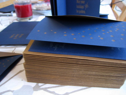
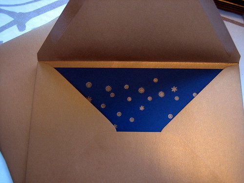
The hardest and most ridiculous part of printing our Christmas cards was the nearly 2 hours it took us to open the vacuum-sealed can of ink. Fortunately, the set up and registration was comparably easy and unusually fast after that. It was my first time using oil-based ink and the platen was either over-inked or there was too much packing and pressure on the plates because the print is not clean. At any rate, we finished just in time for Christmas! And through the thoughtfulness and generosity on the part of several people, I got a brand new copy of the CS5 Design Suite!
I hope everyone's holidays were wonderful.
Wednesday, December 15, 2010
My First Print Run!
I think I can safely post these images now... invitations were mailed and hopefully received by now by anyone who might happen to check this blog ...
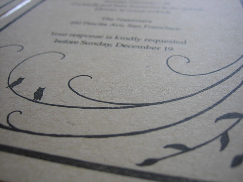
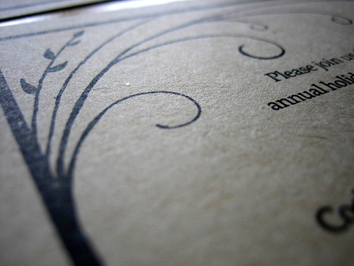
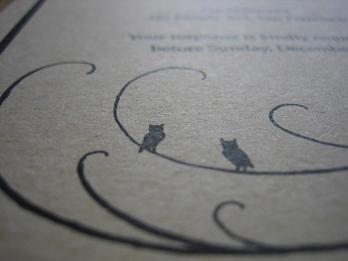
The clients are friends, and the beautiful frame with the leaves and owls was hand drawn and provided by them, so I can't take credit for the design.
Overall I was pleased with the print quality. I've learned at the Center for the Book that a lot of what people like in letterpress is error - the heavy impressions, for example, and sometimes, the inconsistency. The paper was fairly thin and flat so I didn't allow for much impression in this case; when I did, the ink was too visible on the back side. I was mostly happy that it was a choice, that I was able to successfully control the impression. The thicker lines didn't always print as a solid, dark black, but that was somewhat expected. I definitely learned a lot in the process and, next up, Christmas cards ... better late than never, I hope!
Friday, December 10, 2010
Imprimatur: Let it be Printed
Let's hope the Latin translation is correct. Everything sounds better in Latin.
A couple things:
1. The new header is not my logo. I am very much in continued transition where the letterpress is concerned and not ready to jump into business. Still, I've heard that if you have a press you should name it. Not the press literally, but your work.
2. For now, I'm going to keep this blog for what it is: a place to share progress & projects. A new blogging platform or website may come later when I have inventory to sell.
3. Milestone achieved! Though arduous, though imperfect, though slow ... we finally have all the parts necessary to actually use the press, and we did our first print run last night. Photos to come soon...
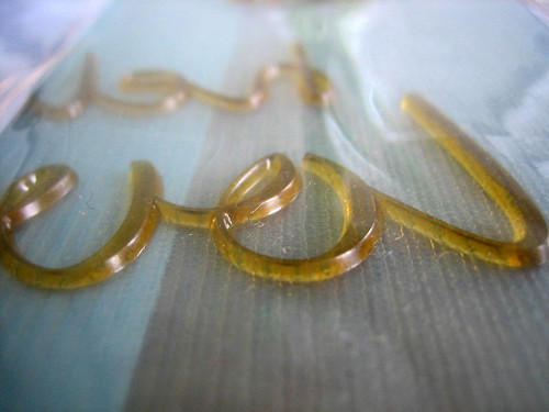
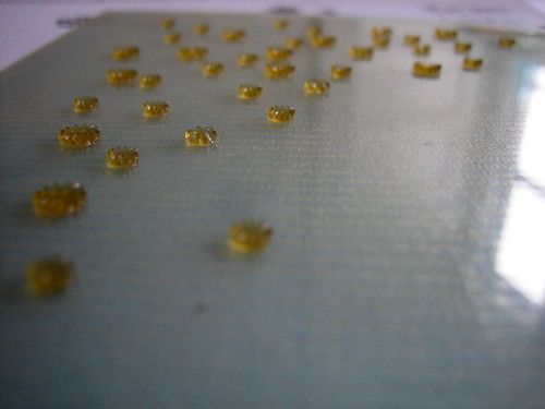
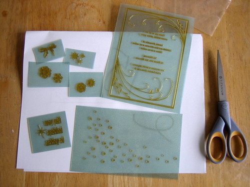
In the meantime, this is what polymer plates look like:
A couple things:
1. The new header is not my logo. I am very much in continued transition where the letterpress is concerned and not ready to jump into business. Still, I've heard that if you have a press you should name it. Not the press literally, but your work.
2. For now, I'm going to keep this blog for what it is: a place to share progress & projects. A new blogging platform or website may come later when I have inventory to sell.
3. Milestone achieved! Though arduous, though imperfect, though slow ... we finally have all the parts necessary to actually use the press, and we did our first print run last night. Photos to come soon...
In the meantime, this is what polymer plates look like:
Subscribe to:
Posts (Atom)