Sunday, November 29, 2009

all that glitters...

Real Simple magazine and I have some gift wrap ideas in common this year: ditching traditional ribbons and bows in favor of a single, statement-making piece like a flower or feather (or anything decorative, really).

Since I used up my leftover wrap last year, I was free this season to go hog wild, and I did. I bought everything I liked: prints in all colors, and glitter wrap in white and hot pink. It's uncharacteristic, but this year I am all about the shine. I even wore sequins to Thanksgiving.

I also found string with little pom-poms at Arch that somehow said "Christmas" to me (reminiscent of snowballs, maybe?), as well as glittering leaves at Michaels craft store. Once I saw the glitter, my inner three-year-old surfaced and I began grabbing fistfuls.


Sparkle can be hard to resist, and at 29 cents each, these leaves are arguably cheaper than a traditional bow, and certainly more statement-making.

progress report.

I must admit that I underestimated the challenge that it would be to get a letterpress up and running in roughly 3 months - and during my spare time. I bought the press in August and self-imposed a deadline, which was to print Christmas cards before, well, Christmas. While the deadline kept me motivated me to keep buying supplies, there have been other dependencies I didn't count on. I'm hearing silence from vendors about re-covering my rollers, and the boxcar base I ordered... still back ordered. Since my press is a little bit less common than other presses of its type, it involves some special sizes and rarer parts. Also, since I work full-time and have other obligations, I'll admit that I haven't always been dogged about following up.

What I have done in the meantime is to buy paper. And definitely more paper than I'm showing here. In order to buy paper wholesale, it's often bought full-size: 8.5 x 11. Card makers use large paper cutters to cut paper down to size, and a bone folder to score them (fold in half). At this stage, I'm buying paper pre-cut and scored, which means the paper is more expensive. But I still have a lot to learn about what kind of paper I like using, and which works best with my press.


So I've been looking around to see what's on sale. I was able to buy up some A2 folded cards and envelopes in pale pink ("Blush") that Paper Source was closing out (this is the same paper I used for our wedding Thank Yous), and some fun, long fuchsia envelopes. At another store, I got a whole box of recycled brown paper envelopes and cardstock made of bamboo. Most recently, I bought very some fine, thin Italian paper and envelopes in a nice eggshell color from Cavallini & Company's annual warehouse sale.

The piles of paper have, in turn, led to some very late 'spring cleaning' at our house.

The recent Cavallini & Co. sale was, in particular, very fruitful. I bought a little of everything they sell, I think: journals, gift wrap and tags, rubber stamps, stickers, note cards, etc. These glittering holiday postcards might just have to be my backup Christmas cards.

Sunday, November 15, 2009

the stories within.

It's like someone at Anthropologie read my blog...

(Don't I wish!) But here's a few images from the November 09 catalog. More paper trees from recycled books:


It's been a busy weekend. I guess they all are lately, and now I'm procrastinating on some fellowship applications, but am rather proud of myself for going into Anthropologie today and not buying any clothes (socks don't count!). They did have, however, a cookbook from The Hummingbird Bakery, located on Portobello Road in London, where I had the best cupcake - pink vanilla marshmellow - and now I have the recipe! Perhaps, if I finish what I am supposed to be doing, I can make some.

**Post-post update (11/16): One day later, the Chronicle Books Blog is also featuring the Anthropologie catalog. Am I a trendspotter or what? Actually, the scoop I recently learned at a BBQ this past weekend, where I met an employee of Anthropologie, is that they just launched a new blog called The Anthropologist. It was described to me as being similar to the much-loved The Sartorialist, although a quick look reveals: "The Anthropologist is an online space for inspiring works and inspiring individuals." For example, Jane Campion's virtual production scrapbook from her film Bright Star (which I still want/need to see), is posted there. Quite lovely.

Saturday, November 14, 2009

paper flowers.

This last week we celebrated Veteran's Day - Remembrance Day - or Armistice Day. The Flickr blog posted this collection of images, which I thought were lovely, albeit humbling, and sad, and sobering.


I love real flowers, but this is certainly an alternative. Whatever your politics, I'm glad there's day to remember and to thank those who have served, risked or given their lives.

The images above reminded me of the paper flower kits from Paper Source, which someday I may try to construct. I've never known what I'd do with these, but I am liking the idea of found-object chandeliers lately, and so maybe a falling, paper-flower chandelier can be added to the list of someday-projects.


Friday, November 13, 2009

falling in love with fifi lapin.

Sfgirlbybay guest blogger anh-minh wrote yesterday about decorating one's house with fashion illustrations, cheaply found second-hand. At the bottom of her post she also included some other illustrations, including this:


If you know me at all, this is pretty much the best fashion illustration I've ever seen. Immediately I followed the links to the Fifi Lapin Shop.

Lapin is French for rabbit. Here at home with me, I have an 11-year-old rabbit named Simon. I think Simon could have a little crush on Fifi and her cute outfits.


Fifi also travels:


Moreover, while you can purchase nice prints of these illustrations and photos, you can also purchase ... yes, greeting/post cards.


As my final aside, I've also had my eye on this rabbit illustration by eekdesign on etsy:


I'm trying to think of what Simon would wear if he wore clothes... I think maybe a cool old-timey hat.

Tuesday, November 10, 2009

theories of relativity.

I'm having a lot of creative firsts lately. Not first-ever kind of experiences, but first-in-a-long-time types of things.

And I learned the hard way, this weekend, that I had the wrong type of paint for the particular object I wanted to re-paint in our apartment, and reminded myself, by trying, that I was never any good at acrylic or oil painting on canvas.

Photography-wise, I'm playing with new cameras, but also using older cameras in new ways. I shot color film on a manual SLR that I've only ever used to shoot black and white. I thought the light meter was broken but the roll turned out basically okay. On their own the pics aren't fantastic, but I like the way they look when put together:


Sunday, November 8, 2009

visual acoustics.

Props to my husband for knowing about this film and suggesting we go see it. We actually saw Visual Acoustics on its opening night at the Shattuck Cinemas in Berkeley. Subsequently, the film has also opened in San Francisco.


It was one of those nights where best laid plans went awry, and it was actually the second time within a month that my plans to have dinner at Angeline's Kitchen and then see a movie at this theater have been thwarted. First there was Friday evening traffic on a rainy night, then the restaurant was teeming with patrons and there was too long a wait. So we went to Beckett's Irish Pub instead, and by the time our appetizer and salad finally arrived, we had 3 minutes - literally - to chow down and get the check. It was not the relaxing night we wanted to have and tension was mounting. It took us more like 8 minutes to wrap up our pseudo-dinner of garlic fries and spinach salad.


We'd bought the movie tickets online, earlier in the day, and once again had to wait in line at the box office to pick them up. By the time we got into the theater, the movie had already begun and... drumroll please... there were no seats. I mean it, not a single seat in the house except for some large bean bags directly under the screen. What to do? There was actually a pool of people standing in the back because the theater had most definitely oversold tickets to the film. The manager said the only way we could have a refund was to leave. Instead, we sat on the floor, at the top of the center aisle and made the best of it. It'll be one of those experiences we look back on fondly, perhaps, in later years because it was something different. The time we sat on the floor.


We were, after all, on the hunt for inspiration. And we found it.


The film is about architectural photographer Julius Shulman, who made his career - and really pioneered the career of architectural photography - by taking pictures of the work of modernist architects. This includes the most notable Frank Lloyd Wright. The film follows modern day Shulman (recently deceased) as he returned to sites he'd once photographed, re-met architects he once worked for, and as he watched the Getty Museum pack up and move his entire life's work from his home to their archives - for posterity, but can you imagine?


The film reminded me of how interrelated things are: architecture, design, photography, engineering, etc. Many modernist architects were mindful of the landscape on which they were building and some of the more unique designs must have been feats of civil engineering. Shulman's photographs really did justice to the buildings and, as the film suggested, made a space look better than it was - which is maybe what most artists try to do: make life better, more beautiful, and more livable than it sometimes feels.


Sometimes the only time we notice design is when it's bad. For me, most often, I notice design in public restrooms, when stalls in an airport are too large or small, or when the paper is just out of reach. (And don't even get me started about modern tract homes!) Or this particular movie theater, as it were.

A lot of the modernist homes have a dated feeling - the boxy, clean lines, the simple materials - and don't always appeal to my aesthetic. At least, they didn't until I realized how much of the design was concerned with the way light would pass into the home and where it would fall. By contrast, many of the modernist public buildings are truly beautiful and often large and striking and strange. e.g. the Guggenheim.


Yesterday, the morning after the film screening, I met up for lunch with a girlfriend, her daughter and husband, and learned that her husband's job had something to do with looking for hazards - toxins, chemicals and other dangers - in things designed and built. New technology and new ways of doing things contain risk, and I guess it's his job to scientifically mitigate these risks; another unseen partner in those things designed and presented to the public to consume or inhabit. The things we don't think about by the time we stand in a space already constructed. It was Shulman's job to find the best way to look at these spaces, to put the viewer in the room with him. He was, essentially, selling the building, the architect, the principles. And he believed in the product because when post-modernism came along, he quit.

Shulman himself was inspiring. One thing I really liked was that he said that if there was something in the shot that he didn't like but couldn't change, then too bad. You have to work with what you have.

Friday, November 6, 2009

harder than it sounds.


Cards with quotes and inspirational sayings are fairly common. This is one I came across recently that I really liked, at a wonderful little local bookstore called Thidwick Books. I also love the vintage feel to the design.

This card was printed by Found Image Press.

Tuesday, November 3, 2009

dia de los muertos.

As posted a few days ago, San Francisco holds an annual procession in the Mission District that I very much wanted to check out.

Although I grew up in a wonderfully racially diverse community, Day of the Dead was a holiday I was largely unaware of until a trip to Mexico, where my husband bought one of the skeletal figurines.


On subsequent trips to Mexico, I also fell in love with the textiles, embroidery, silver workings, flowers, and all the religious imagery: Catholic, ancient and indigenous, and superstitious. So, it follows that I am very much drawn to the Day of the Dead celebrations and aesthetic.


The website for San Francisco's celebration begins with this lovely quote:

Don't just cry mournfully over the individuals, dreams and influences that have helped make you what you are. Dance for them; sing for them; honor them; leap into the air and kiss the sky for them.


Celebration of holidays was always a large part of my upbringing: big family dinners, religious and cultural festivals, and annual traditions like pumpkin carving, or sending cards or gifts... But now that I'm married and making these sort of decisions anew, it's interesting what my husband and I do and don't do. This year for Halloween we were sick, so we didn't do much of anything, but I do get sentimental when I stop and think about what Day of the Dead & All Souls Day mean - in general, and to those people holding a candle for someone they love and miss.

As I think about making greeting cards, I question the ethics of adding more paper to a landfill. I ask myself: Why do people still send cards? Why do they like to receive them? Do they?

I don't really have the answers, but I guess I like the concentrated thought - the effort of selecting a card or sitting down to write a message. I think that moment, right before the pen hits the paper, might be the most important. But so is following through -- letting the person know that you thought of them.

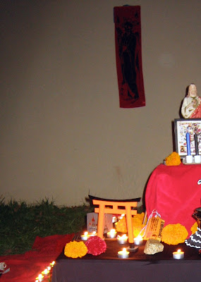
So, in a similar way, I loved the idea of a procession and community-made altars. Each time a person laid down a marigold, it was in someone's name. Before the whole dancing parade of skull-painted faces began, there were people in a community talking about their altars and holding photographs, and wanting to celebrate the beautiful lives of those who are no longer here.

I think next year maybe I'll work on my own altar at home.

My camera doesn't do well at night, but here's a bit of what I came up with: