


Sunday, December 26, 2010

Year One: Letterpress Christmas Cards


My husband asked how I felt about having created a Christmas card from start to finish and the answer was: relieved. Meeting this goal has been on my mind for more than a year. However, I wish the preparation had been; now I understand why Christmas begins in July.

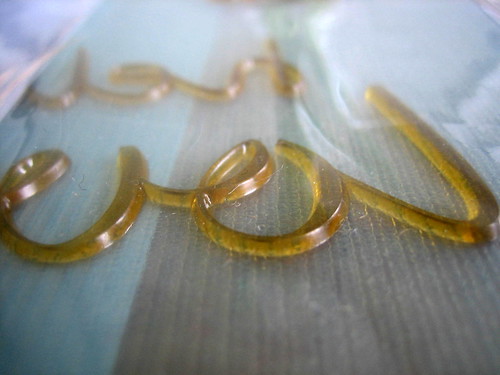
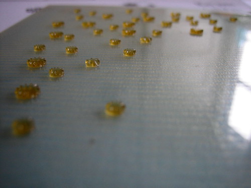
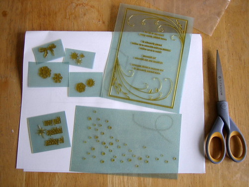
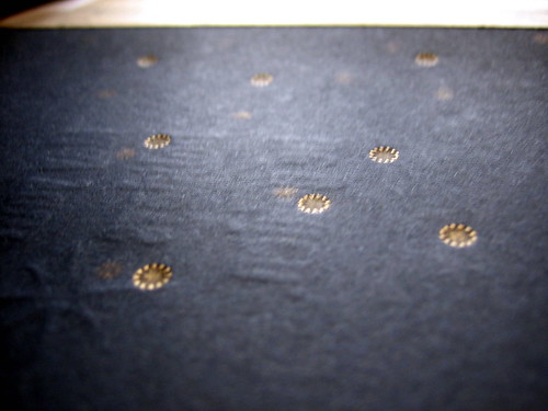
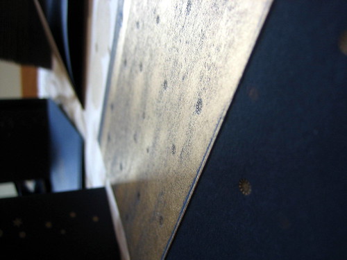
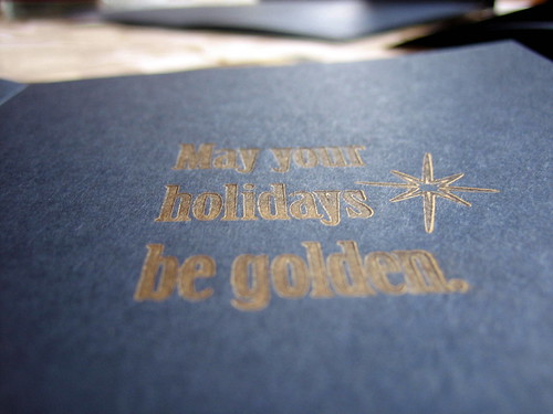
Our inspiration was a cross between constellations and chapel ceilings. The design, a term I'm going to use loosely here, since it was done quickly and after midnight one night, actually resembles neither chapel nor night sky. We went with a back-up design after not liking how our initial one printed. Some of the photos above are mess-ups, as it was tricky business running the cards through a couple times and not letting them stick to the ink plate. The mess ups were quite pretty in some ways - large, unexpected swashes of gold.
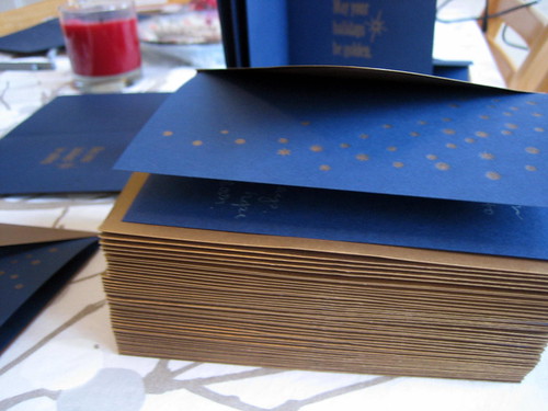
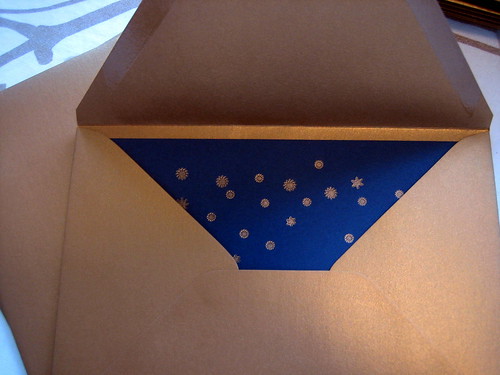


The hardest and most ridiculous part of printing our Christmas cards was the nearly 2 hours it took us to open the vacuum-sealed can of ink. Fortunately, the set up and registration was comparably easy and unusually fast after that. It was my first time using oil-based ink and the platen was either over-inked or there was too much packing and pressure on the plates because the print is not clean. At any rate, we finished just in time for Christmas! And through the thoughtfulness and generosity on the part of several people, I got a brand new copy of the CS5 Design Suite!

I hope everyone's holidays were wonderful.

Wednesday, December 15, 2010

My First Print Run!

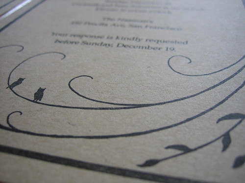
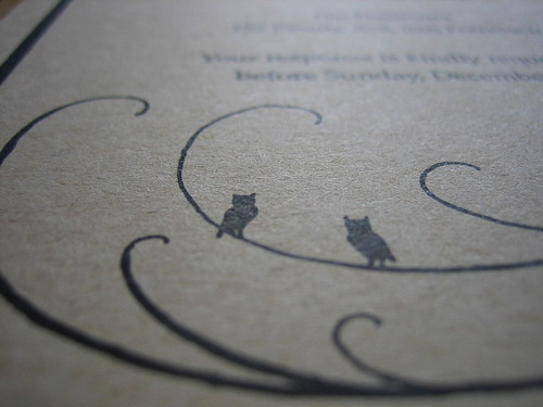
I think I can safely post these images now... invitations were mailed and hopefully received by now by anyone who might happen to check this blog ...


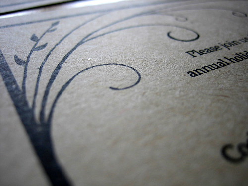
The clients are friends, and the beautiful frame with the leaves and owls was hand drawn and provided by them, so I can't take credit for the design.

Overall I was pleased with the print quality. I've learned at the Center for the Book that a lot of what people like in letterpress is error - the heavy impressions, for example, and sometimes, the inconsistency. The paper was fairly thin and flat so I didn't allow for much impression in this case; when I did, the ink was too visible on the back side. I was mostly happy that it was a choice, that I was able to successfully control the impression. The thicker lines didn't always print as a solid, dark black, but that was somewhat expected. I definitely learned a lot in the process and, next up, Christmas cards ... better late than never, I hope!

Friday, December 10, 2010

Imprimatur: Let it be Printed

Let's hope the Latin translation is correct. Everything sounds better in Latin.

A couple things:

1. The new header is not my logo. I am very much in continued transition where the letterpress is concerned and not ready to jump into business. Still, I've heard that if you have a press you should name it. Not the press literally, but your work.

2. For now, I'm going to keep this blog for what it is: a place to share progress & projects. A new blogging platform or website may come later when I have inventory to sell.

3. Milestone achieved! Though arduous, though imperfect, though slow ... we finally have all the parts necessary to actually use the press, and we did our first print run last night. Photos to come soon...

In the meantime, this is what polymer plates look like:


Monday, September 13, 2010

Forward Momentum

After a long blogging hiatus, I'm back. Well, sort of. Only to say thank you for reading this blog, and possibly also my previous blog - both explorations of blogging in general, a method for holding myself accountable, or just to write things down.

The first bit of news is that I've ditched the "sublime paper goods" name in favor of something a little sweeter and more personal: rabbit et roses press, the logo for which has been outsourced to someone with superior design skill and know-how.

That said, Red (the press itself) and I have made a little progress of our own. The changes will appear subtle and hard to discern, perhaps, but those rubber rollers actually live on the press now, and there's tympan paper against the platen and makeshift paper guides, and everything has been adjusted to the height it's supposed to be - or, at least close enough to determine that the press, never used for printing by its previous owner, is in good shape, which is a giant relief.


What you see below is the chase, inside of which is a Boxcar base, quoins, furniture and reglets. I'm not storing this inside the press because keeping everything taut inside the chase will, over time, bend and stress the frame.


You'll note that my official printing apron showcases different types of pasta. I didn't know the apron was missing until I found it, buried in an old box of college art supplies. It's from a tourist's market in Florence, Italy. At the time I either thought it was funny, or I really intended to learn the different types of pasta. Perhaps one day I will. It was a happy discovery though. I can picture the market and the sunny plaza, and in some ways, standing before my letterpress is akin to being twenty again, alone outside the Uffitzi beneath a replica of The David, in a foreign country for the first time - a good, but at times bewildering experience.


The first print! Saved for posterity's sake. The sweet little bowls we printed during our test run are not mine. Rather, the deep relief plate was borrowed from Lisa Rappaport of Littoral Press. You can see that the bowl on the bottom did not print throughly. This means the platen is not level and though we fussed with it for an hour or more, Lisa's time was money and so I'll continue fussing with it on my own. 


Where I am going from here, I can hardly be sure, but a Christmas card will be both good practice and a good goal. (Also, S&S, perhaps some dinner invitations?)

Tuesday, June 1, 2010

National Stationary Show Web Round-Up

Someday I hope to attend the National Stationary Show. The 2010 show happened in mid-May in NYC, and Design*Sponge provided coverage of the show (what they liked, what they saw trending) in a series of posts. All the just plain pretty stationary aside, here are a few things that jumped out at me.

(1) A sweet one from The Great Lakes:


(2) A vintage aluminum Christmas tree, from pancake & franks, which I love for obvious reasons:


(3) This cheeky, clever print from Old Tom Foolery:


(4) And from their website, and because I used to have grandiose visions of myself working for newspapers, I also loved the idea and look & feel of The Headlines Collection:


(All pictures from Design*Sponge, except the latter two, from Old Tom Foolery.)

Pretty random, I know. Kind of amazing to read through the full Design*Sponge coverage to see just a fraction of what's out there -- all the good design and fun prints.

In other news: my letterpress moved to our studio room this weekend and sits atop its new desk! Big thank you to my husband and his buddy Matt for their brute strength.

Monday, May 24, 2010

La Vie en Rose

In the midst of winter, I found there was, within me, an invincible summer. ~Albert Camus


I was feeling a little on the downtrodden/weary side today and splurged on some pink peonies at the grocery store. A little old lady, incidentally, told me they were her favorite flower. Then she asked how much they cost. "A little pricey," I said, feeling embarrassed. "Don't I know it," she said. "They're even expensive in New York City." For the life of me, I couldn't think why they should be cheaper in NYC.

Then when I arrived home, I found that this beautiful letterpress print by Sycamore Street Press, ordered a few weeks ago, had also arrived. Kismet.


And this is what happens when you get steam from a tea pot on your lens:


Thursday, May 6, 2010

Polaroid Week

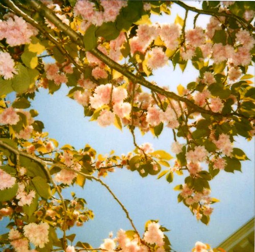
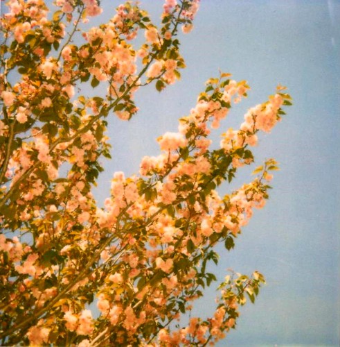
The Flickr blog reported the 'Roid Week 2010 group pool, leaving me with three days left to participate. It just happens that I recently took a stack of pictures on Polaroid film.

blossoms.